
import pandas as pd
import matplotlib.pyplot as plt
import matplotlib.dates as mdates
import numpy as np
plt.style.use('ggplot') # 차트 격자 제공
# 엑셀 파일 경로
file_path = 'IPO_data_simple.xlsx'
# 엑셀 파일 읽기
df2 = pd.read_excel(file_path, sheet_name='Sheet2')
df3 = pd.read_excel(file_path, sheet_name='Sheet3')
import pandas as pd
import matplotlib.pyplot as plt
# 'promise_ratio'의 상위 10%와 하위 10% 경계값 계산
top_30_percentile = df3['promise_ratio'].quantile(0.9) # 상위 10%
bottom_30_percentile = df3['promise_ratio'].quantile(0.1) # 하위 10%
# 상위 10%와 하위 10%에 해당하는 code 추출
top_30_codes = df3[df3['promise_ratio'] >= top_30_percentile]['code']
bottom_30_codes = df3[df3['promise_ratio'] <= bottom_30_percentile]['code']
# t+0부터 t+n까지의 데이터만 추출
df_filtered = df2.iloc[:360].copy() # t+0부터 t+n까지
# 상위 10%와 하위 10% 그룹의 시계열 평균 계산
top_30_mean_series = df_filtered[top_30_codes].mean(axis=1)
bottom_30_mean_series = df_filtered[bottom_30_codes].mean(axis=1)
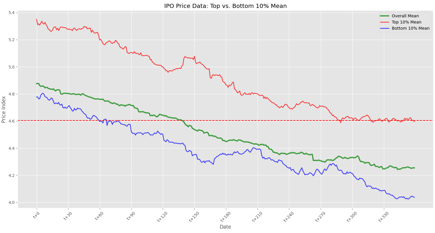
plt.figure(figsize=(15, 8))
# 전체 평균 시계열 그리기
plt.plot(df_filtered['date'], df_filtered['mean'], label='Overall Mean', alpha=0.7, color='green', lw=3)
# 상위 10% 그룹 평균 시계열 그리기
plt.plot(df_filtered['date'], top_30_mean_series, label='Top 10% Mean', color='red', alpha=0.7, lw=2)
# 하위 10% 그룹 평균 시계열 그리기
plt.plot(df_filtered['date'], bottom_30_mean_series, label='Bottom 10% Mean', color='blue', alpha=0.7, lw=2)
plt.title('IPO Price Data: Top vs. Bottom 10% Mean')
plt.xlabel('Date')
plt.ylabel('Price Index')
plt.xticks(rotation=45)
plt.gca().set_xticks(df_filtered['date'][::30]) # 2개 간격으로 x축 눈금 설정
plt.gca().set_xticklabels(df_filtered['date'][::30]) # 2개 간격으로 x축 라벨 설정
plt.axhline(y=4.605, color='r', linestyle='--') # y=4.605 인 수평 점선 설정
plt.legend()
plt.tight_layout()
plt.show()
'Python' 카테고리의 다른 글
| DART 고유번호 (0) | 2024.03.07 |
|---|---|
| 시계열 그래프 그리기 (특정값을 기준으로 색채도 구분) (2) | 2024.02.29 |
| 중복 변수 찾고 데이터 추출 (1) | 2024.02.28 |
| IPO stock_crawler (1) | 2024.02.22 |
| Regression_2 (1) | 2024.02.18 |